

SoyLabs is a cutting-edge nutraceutical company that is developing proprietary soy-based powders, peptides, albumins and formulaic compounds for inclusion in nutritional supplements, functional foods & beverages (whew!). The company began as a cooperative effort between researchers at the University of California at Berkeley and the Missouri Soybean Growers Association. I was asked to help develop their identity and put a public face on what had been a research and development effort but what was now ready to become a company. Let the fun begin!
We began with the development of this logo with FIT Design of Brea, California, choosing the initial font and beaker image with the “soybeans in a pod in a lab beaker" element, the type appropriately sharp but not too sterile as the company was going to be appealing to the general health conscious public. We wanted it “buttoned up” but not stodgy, too clinical or too technical.
Click upper right + on images to view enlarged without copy.

I designed their stationery, business cards and a folder (left) for presentation packets. The company has now moved their offices and development facilities from Fairfield, California to Mexico, Missouri as they are now the managing tenants of the new Missouri Plant Science Center. For this reason I designed both the logo for MPSC and created a second set of business cards with the MPSC logo and information on the back of the SoyLabs card.
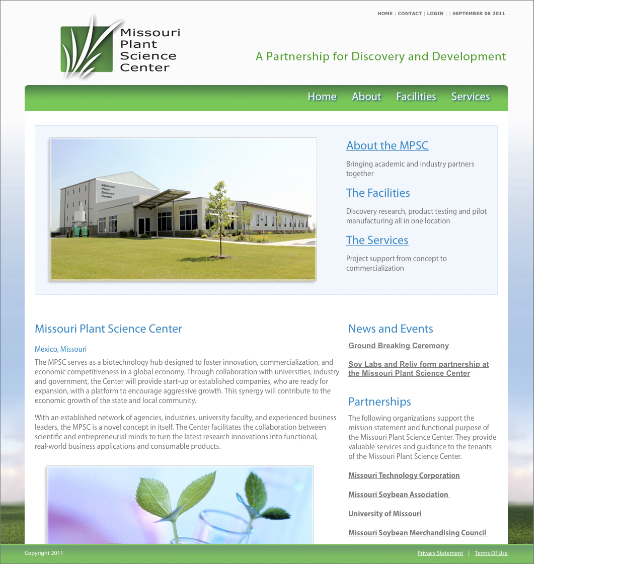
From the MPSC website: The MPSC serves as a biotechnology hub designed to foster innovation, commercialization, and economic competitiveness in a global economy. Through collaboration with universities, industry and government the Center will provide start-up or established companies who are ready for expansion with a platform to encourage aggressive growth. This synergy will contribute to the economic growth of the state and local community.

A series of related logos needed to be produced for the various products SoyLabs was offering. Lunasin, the primary extract of soybeans the company had developed, was to be the company’s bread and butter offering. The SP and XP variants were to be variations of the logo primarily representing higher concentrations of the product’s active peptides.

With the completion of the various logos I proceeded to designing and producing this 41 page Brand Standards Manual for the company.

I produced several designs for the SoyLabs website in cooperation with the good folks at FIT Design, this one being a synthesis chosen for both its elegant simplicity and ultimate ease of client updates. It displays very well on handhelds and is in keeping with the rich color and inviting character both FIT and I have attempted to give the company as a whole. No drab and sterile tech heads, the folks at SoyLabs are down to earth real people who just happen to be on the cutting edge of neutriceutical science!

I've included these two infographics I designed and illustrated as they are really fundamental to SoyLabs identity. Showing both the mechanism of absorption of Lunasin into the body and its function for lowering cholesterol the information is vital to explaining the importance and value of the company's primary product.

Yes, for anyone with less than a degree in human biology this might be a bit much to take in but it really is a simplification of the process by which Lunasin aids the body in reducing the amount of the bad LDL type of cholesterol in the bloodstream. No, really, it does!

I created these three illustrations to further explain the process of LDL cholesterol reduction. They were used both in the previous infographics and in presentations to potential investors and the general public. They were also used as a guide for the development and production of a video that can be viewed at the Lunasin website.

My design for SoyLab's portable trade show display - original design and the actual assembled display.

As mentioned earlier SoyLabs became the first and managing tenant of the new Missouri Plant Science Center and they came to me to design them a logo.

With the new logo we put together this website in the same design theme as the SoyLabs and Lunasin sites.

Everyone knows a local band you really like, right? A friend or a friend's friend or yourself and your buddies getting together to jam & just have fun. Well, The Classics were a group of guys (and sometimes girls) who just liked to rock! I was asked to do them a logo. I came up with this 50's style emblem that might have been found on a car of that era. It captured their essence and they were quite pleased.

A logo I designed for a Redding, California, nursing care center. It never made the cut but I'm still fond of it...at least I prefer it over what they now have. Oh well, c'est la vie!

A little piece I did a while ago...I just like it, design, illustration and the message. Maybe I'll sell it to a stock house...or not.