








If you're like me you may have fallen in love with SOBE's line of unique bottled beverages. I once had a shot at designing the label for the Lizard Lava flavor. I produced this design which I really liked, but unfortunately the client went in a more cartoon flavored direction. Though never used I keep this piece of packaging design and illustration in my portfolio as "the one that got away".

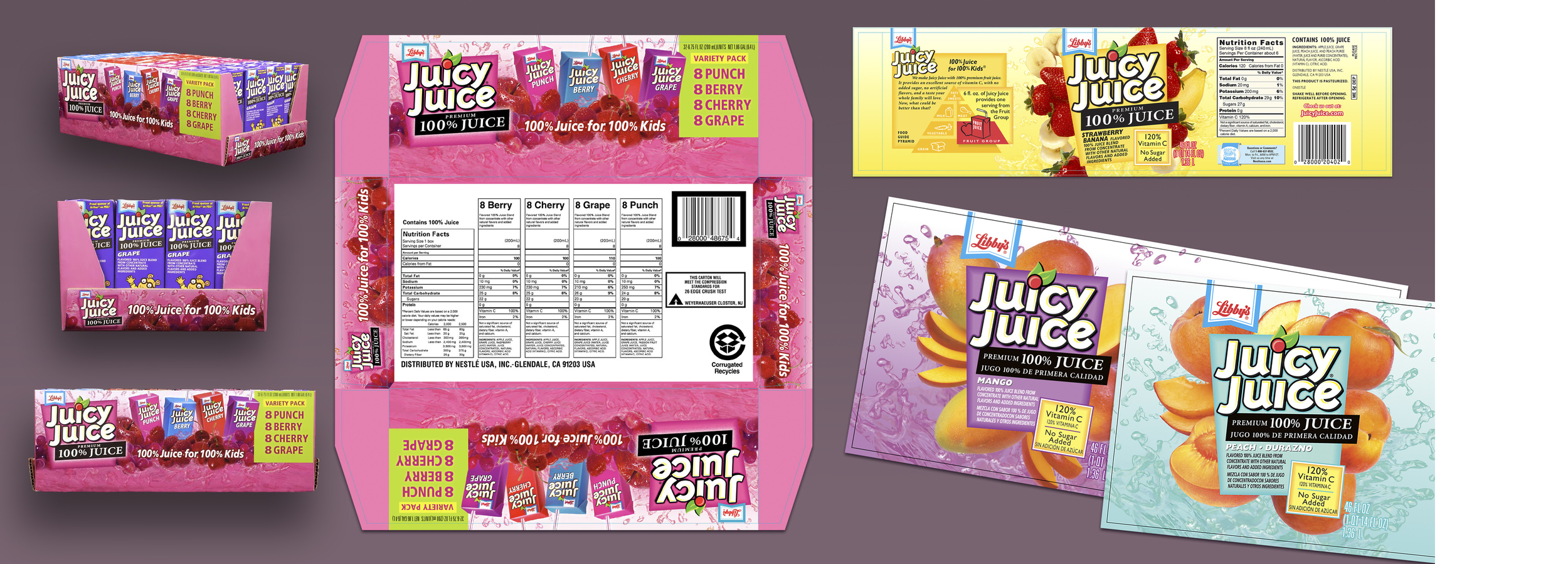
Agency: Enterprise/IG, San Francisco — The great people at Enterprise/IG were developing the packaging for the entire line of Juicy Juice products and asked me to be a part of the effort. I was tasked with several elements of the effort from producing the fruit arrangements on the actual soft packages to illustrating the finished packages themselves with the fruit, juice and name "popping" out of the package in a kind of juice explosion as above.

Above are four of the actual packages with my fruit and splash arrangements and the cover of the 10 Pack box with my "exploded" package image.

This piece with the small carton containers I put together for the sides and end of the shelf display box (see next image).

Above left is the display box flat and loaded for shelf display. On the right (above) is one of the carton labels with my fruit and splash arrangement and below it two of the 46 FL.OZ. wrappers.

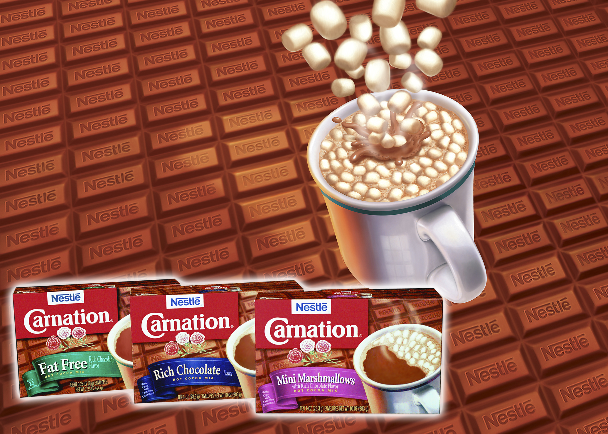
Agency: Enterprise/IG, San Francisco — The folks at Enterprise/IG also involved me in the design and production of packaging for the Carnation line of cocoa mixes for their client Nestlé. Here are three of the eight flavors I worked on initially. The print production ran in the millions—certainly one of the largest projects I've been involved with—and the client was quite pleased with the results.

Much of my work on the project involved the expansion into new flavors requiring new accompanying illustrations for those flavors. From chocolate caramel (above left) to the "smores" flavor (above right) I sketched various ideas until we came to a final design that made the Nestlé people smile.

Here are a few of the parts that went into the production including duotone ribbons for each flavor, individualized cups with the corresponding flavor "fill" and a number of accompanying illustrations related to specific flavors, here vanilla and English toffee.

Agency: Enterprise/IG, San Francisco — Here I worked with the Enterprise/IG designers to compose the package design of the three Dunk'ers varieties and I prepared all of the artwork for the three package fronts.

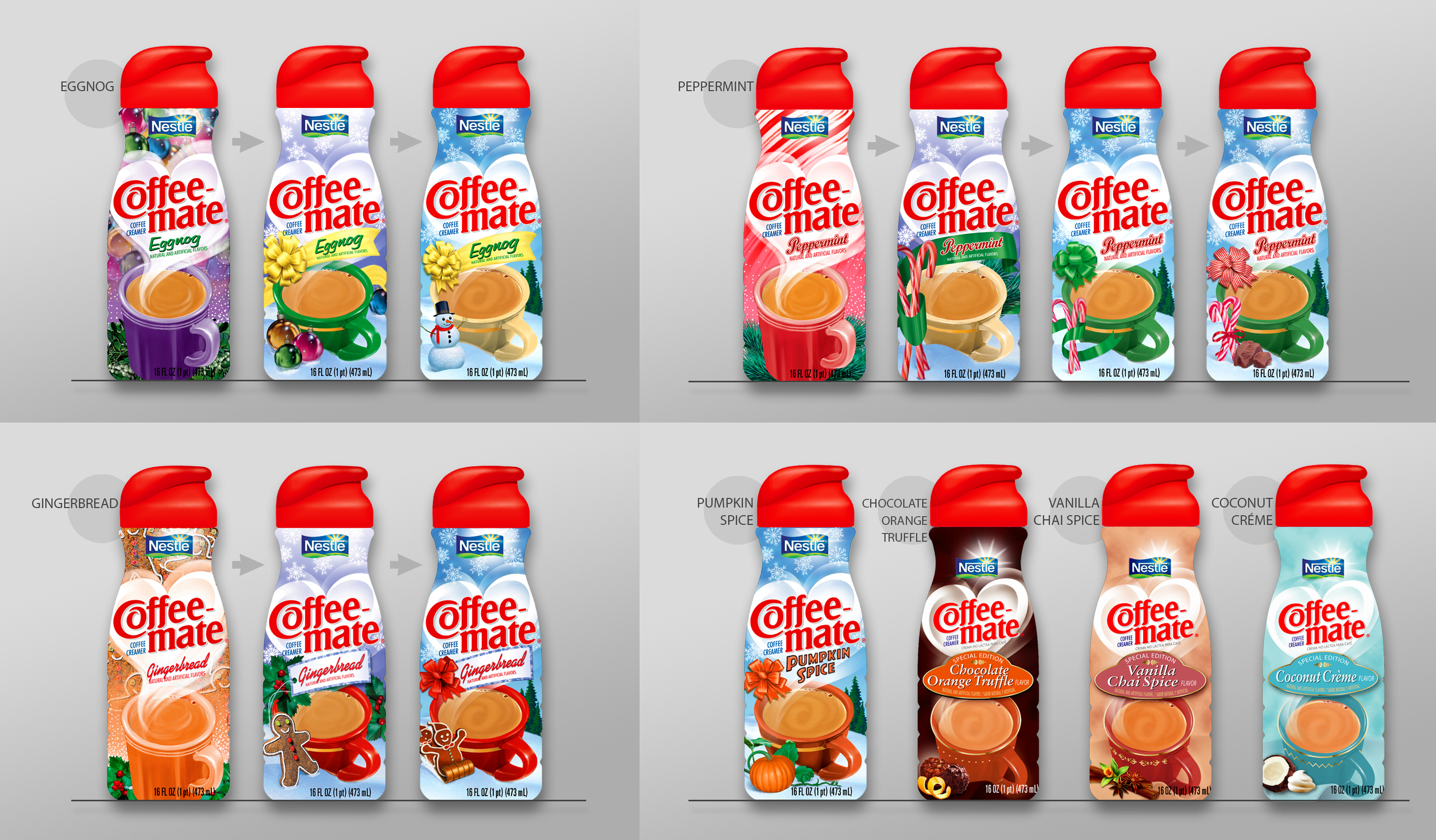
Agency: Enterprise/IG, San Francisco — With the Holiday Coffee-mate Creamers packaging the Enterprise people asked me to do preliminaries for three flavors - Eggnog, Gingerbread and Peppermint. My initial designs (left in each row) were presented to the client who felt their conservative audience would prefer something a bit less "designy" and more traditional "greeting card pictorial" style. You can see the evolution of my comps to the finished art version last in line. In the lower right you see the last minute addition "Pumpkin Spice" and then three flavors targeting a higher end client to which we applied a slightly different theme altogether.

Once the design was finalized I was given the job of making the art a continuous wrap-around image that would meet seamlessly at the ends for the shrink-wrap plastic label. I had to blend the image side by side with an open area for the ingredients / nutrition panel. I also created the "sunburst" version of the Nestlé logo for all subsequent Coffee-mate packaging.

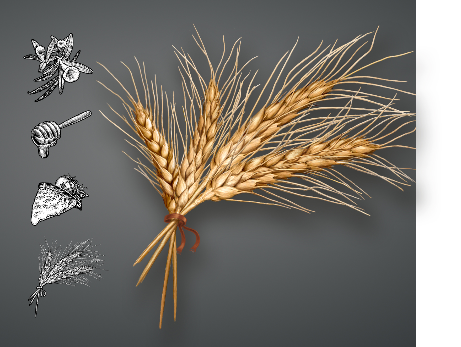
Agency: LPK United States, Cincinnati, OH — For Pringles new Baked Wheat Stix snacks I was asked to create illustrated package imagery with a certain clean realism they couldn't get with straight photography. I produced these images for the Vanilla and Honey flavors as well as the black and white images and bundle of wheat color illustration in the following panel.

As a new product the agency for Joint Juice had only a prototype can in white with a label on it. The final cans were to be reflective silver with a metallic sheen which I had to simulate in my illustrations of the three flavors pouring into a glass of ice. I've done several collaged fruit packages for Dreyer's Whole Fruit Bars, a project similar to the fruits I did for the Arbor Mist line of wines. Nescafé Ice Java required just the right splash at the top as well as an abstract background, both of which I created for all their various packages.

Additional Dreyer's Ice Cream projects I did for their packaging, Banana Split and Fruit Bars as well as the design and production of Mission Solano Coffee Roasters label, a package that was delivered wrapped in a strip of actual burlap coffee bean bag!