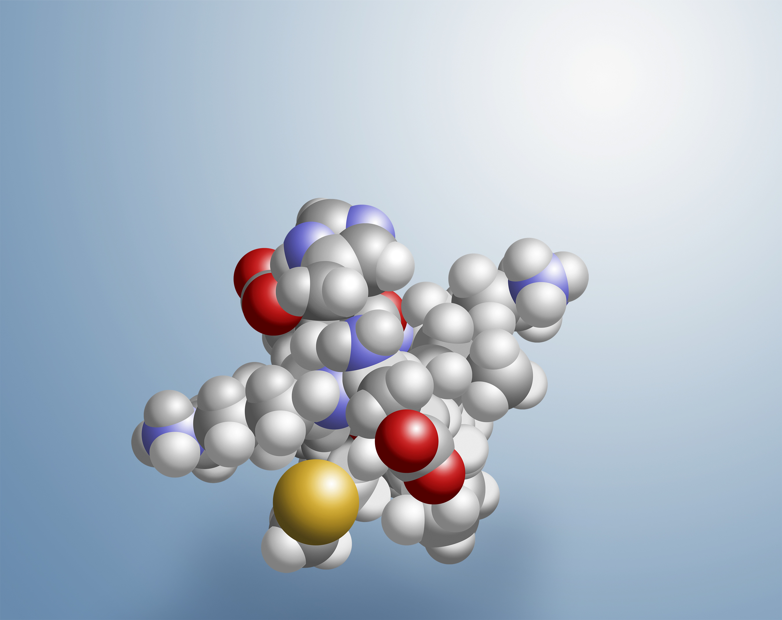


I created this molecule illustration in Photoshop based on a RasMol generated png file of the modeled Lunasin molecule. As the fundamental product of SoyLabs, LLC this image has been widely used by the company as an instructional tool primarily for the "academic" audience.
Click upper right + on images to view enlarged without copy.

After settling on a set of logos developed in cooperation with FIT Design in Brea, California, we immediately began work with the SoyLabs management to develop their website. These are my first couple of comps presented as we searched for the right direction.

We moved towards a more simplified look as we realized the staff would have to be handling updates and alterations. With their research often dealing with rather esoteric subjects we felt adding visual complexity did not serve them well. We chose a vibrant color scheme with recurring color combinations that would appear in their online graphics as well as all their printed materials. This I felt helped reinforce their "new company with fresh ideas" reality...they really were introducing something brand new to the nutraceutical industry. The one above right blended both FIT Design's development with mine and is the design chosen as a starting point.

It was decided by management to produce a second site specifically for their Lunasin product that would incorporate the same design themes. I worked with FIT Design as they produced a simple video primer to explain the benefits of Lunasin to the general public. With a concise voice-over and animated graphics based on my original artwork the tight budget production was quite successful.

The MPSC is a shared-use facility where researchers work alongside business and industry experts in a multidisciplinary environment. With SoyLabs position as the managing tenant at the new facility I was brought in early on to create a logo and coordinated website design for the center.

My former hometown of Redding, CA, was in dire need of an image upgrade. I began with this proposal for a website design based on a branding / identity proposal presentation I and some associates made to the city. Budget constraints ultimately froze our moving forward with the concept but I am proud of the design work.

This collection of "parts" were part of our first design proposal which included my "stamp" logo with the postal cancellation stamp over it with the tag line "THE OTHER CALIFORNIA". The intent was to present this beautiful northern California area as a distinctly different environment and a world away from the southern California most people are familiar with. We hoped to capture the slower paced lifestyle with a nod to it's history, environmental beauty, and unique attractions. The retro stamp logo with it's cancellation stamp is here applied to a promotional postcard, small pocket brochure and an old tattered envelope. I adapted the stamp's design elements to create the masthead for the website design.

A poster / flyer / print and online ad concept coordinated with the new "stamp" identity proposal.

This is a second design theme we presented to the city of Redding, CA. Very near Redding was the location of California's second largest gold strike shortly after the Sutter's Mill discovery in the Sierra Mountain foothills in 1849. I designed this logo here applied to a website masthead.

The Redding area's early gold mining history was instrumental in the population growth in the entire northern California region which ultimately led to the construction of a railroad link and the establishment of the town itself. Here I've designed a proposed brochure highlighting the areas gold mining past and it's recreational attractions of the present. These same elements would be adapted to the website as well as become the theme for an entire branding campaign.

This is an illustration I did to show an alternate use of the logo as though on a pin or medallion with Mt. Shasta behind. The view of the 14,000 foot extinct volcano north of the city is one of the visual delights that can be seen from many locations in and around the city.

I presented this billboard design with six different phrases as a series to be placed along the primary freeway, I-5, passing through Redding north and south. Please take a moment to watch them cycle through. This view of Mt. Shasta is essentially what you see as you approach the city from the south. It is a stunning sight!