
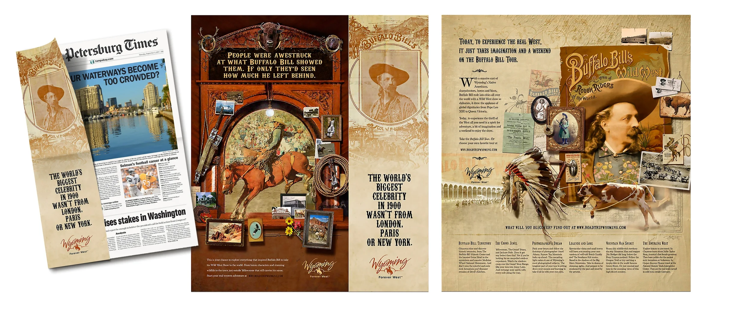
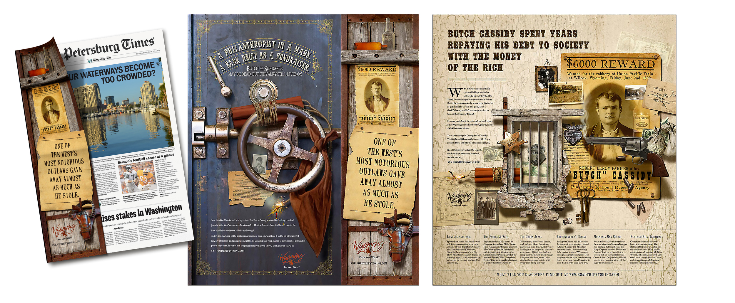








Agency: Barnhart USA, Denver — I was fortunate to have been asked by the good people at Barnhart to develop a series of "flexible" illustrations for their client the Wyoming State Tourist Board. These involved famous people associated with Wyoming history and would need to accommodate a variety of print and web dimensions. It was a rewarding design challenge for me and a very successful campaign.
Click upper right + on images to view enlarged without copy.

Primary to the campaign were a series of spadea which are color broadsheets printed both sides that wrap the outside of a newspaper or periodical. These were run with a broad range of newspapers nationwide, all of which seemed to have slightly different dimensional requirements making the flexibility of my illustrations paramount. All of my collage illustrations had a very textural, 19th century feel to them to capture the old west flavor we were after.

Pictured are four of the famous figures that were included in the series — Theodore Roosevelt, Nellie Tayloe Ross (early governor of Wyoming and the 1st female governor in the U.S.), photographer Ansel Adams and outlaw Butch Cassidy. These are the poster arrangements from which I derived the various print versions and elements for the online imagery.

Pictured are several of the original illustrations included in the Theodore Roosevelt artwork. The Roosevelt "medallion" is my own fabrication of a "period" piece that might have been produced as is the Grand Tetons postcard.

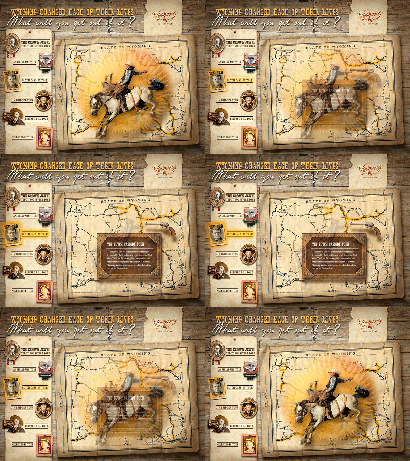
I know, animated gif's are no favorite of mine either — often annoying and you just want them to stop — but I couldn't think of a better way to show a little of the function of the theme flavored microsite accompanying the campaign. Cursoring over the famous folks icons on the left brings up their associated tour highlighted on the aged map with a movable, leather framed info panel that also scrolls with information on the tour. Very slick!

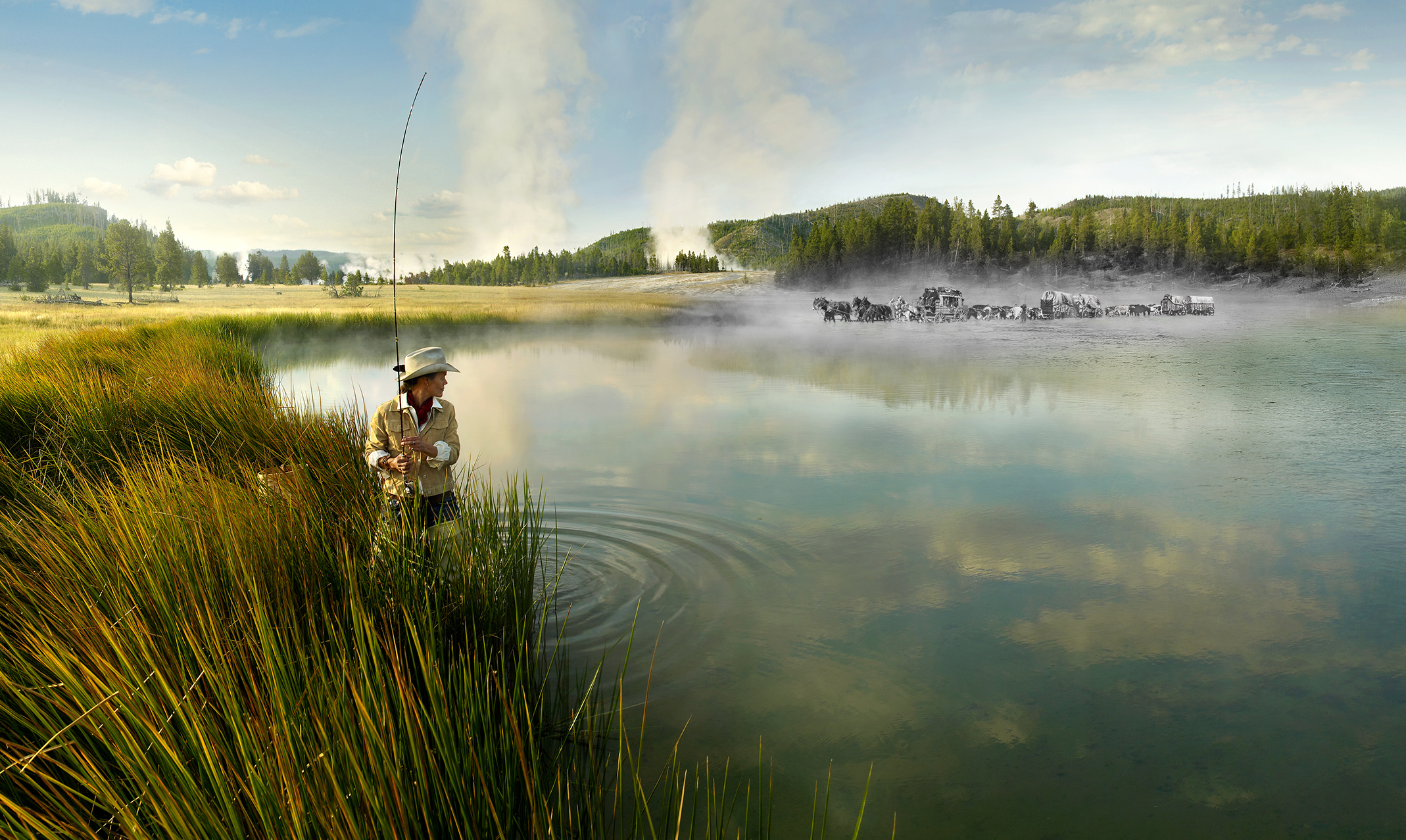
Agency: Barnhart USA, Denver — Another challenging project from the folks at Barnhart, this series involved the blending of beautiful Wyoming color photography with a subtle "look back in time" black and white portion inserted. We tried several versions - trappers in canoes and a wagon train crossing the river are pictured here.

With no actual photography of the historical black and white portions it was up to me to find what I could as reference and construct believable final composited images. The client and I were pleased with the final results.

Out canoeing with his father here a boy's imagination ponders three Native Americans on horseback.

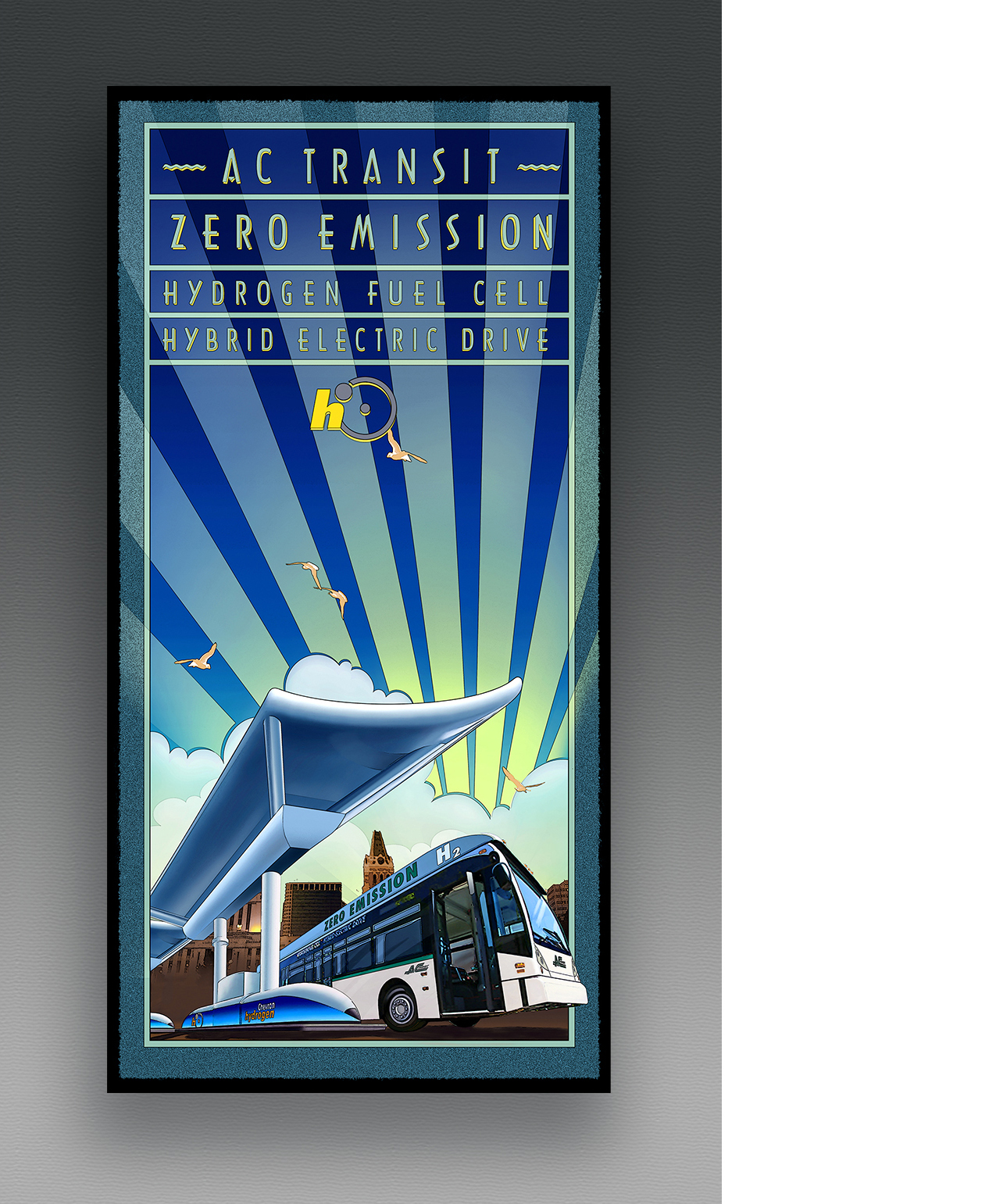
I chose an art deco style for this poster design promoting ChevronTexaco's cooperative effort with AC Transit (Alemeda-Contra Costa counties, CA) in developing hydrogen powered transit buses.

CHEVRONTEXACO, San Ramon, CA — Chevron outfitted a semi trailer with a complete demonstration facility for their Delo truck lubricant products line. I was asked to provide composited photographic artwork for both sides and the rear doors of the trailer. Above left you can see the original design for the trailer, below that my composite work with a frame showing the original photo I had to "build out" in both directions to cover the necessary length. I placed the elevated roadway with truck into the scene and created a new sky for the illustation. You can see some of the reference photos I worked from as well as my composite for the other side with speedometer and products.

CHEVRONTEXACO, San Ramon, CA — Another challenging project for their corporate offices installation were these 3 photos that I had to turn into "wrap-around" continuous images for encircling large columns. The trick was to make the ends of the images meet seamlessly. Deceivingly difficult I had to rework both ends to blend perfectly as indicated. The forth image merely required "building out" at both ends to fit particular dimensions.

Each year in Napa Valley, California, a film festival is held by the non-profit Napa Valley Film Festival cultural organization. A few years ago I was fortunate to be selected to design and produce a poster / program cover for the event. Great people, a great event - what more could you ask for? My reward? Well, my wife and I got to attend at no cost and we had the pleasure of meeting Rita Moreno!

The AIAA is the largest technical society in the world dedicated to the global aerospace profession. That means these people are way smarter than me. Nevertheless they asked me to design and produce the imagery for a poster and cover for the program for their celebration of 100 Years of Flight. I was honored to oblige with this "reconfigurable" poster illustration that was adapted to the program cover and online use.

Agency: Cultivator Advertising, Denver — The good folks at Cultivator designed this small brochure full of gorgeous photography and wrapped with a leather cord pulled through a drilled slice of actual horn! I created the map for their brochure using limbs of a native Bend, Oregon evergreen, small photos and my small illustrations. The client was quite pleased with the results!

Click on the + symbol in the upper right corner of the image and you'll be able to see the subtle details I've put in the map. It was a lot of work but serves the purpose of a map in a uniquely interesting way.

Hal was a man with a vision and from his small shop in Red Bluff, California, he set out to create, etched in stone, Biblical passages in their original ancient languages and scripts. I designed his Beautiful Word logo and suggested he expand his merchandise offering to include other religious items and typographical posters, cards and books. I designed this brochure for him and prepared the design for a like-styled website when fate intervened and for health reasons he was unable to further pursue his dream. I relish the passion of this man and I wish he could have fulfilled his heartfelt goals.

Pete's Wicked Lager was a favorite brew of mine. On a whim I decided to paint an idea that had been "brewing" in my head for some time. I sent a sample to the company headquarters and was pleased when they decided to use it as a case card (with some distracting copy I've left off here). Now it's discontinued, replaced by Munich Helles Lager...even better!

This piece I designed and illustrated for Budweiser through a design firm in St. Louis. My friend posed for the arm positions - thanks Eric! It looks like traditional airbrush because it is...well, most of it. I scanned it into Photoshop and embellished it a bit.

Although originally done for a billboard for Goodyear's Unisteel truck tire line I applied this truck illustration I did to a magazine spread ad design which worked out quite well.

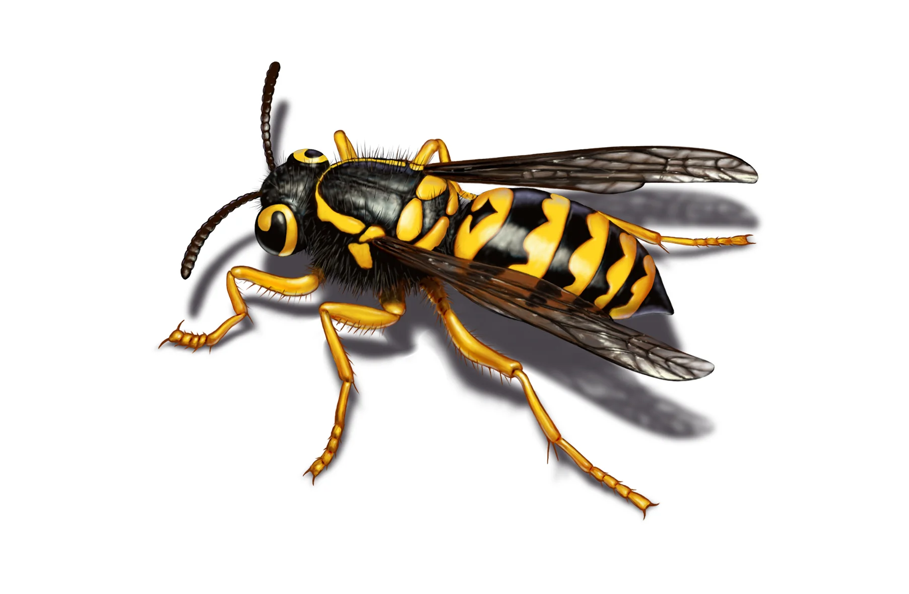
For more than 15 years I've had the pleasure of working with the agencies handling the Orkin pest control account. They found out that I could illustrate the bugs and rodents which proved difficult for them to photograph well. Fortunately for me, when the account left JWT, Atlanta, and moved to the good folks at The Richards Group in Dallas they continued working with me uninterrupted. It's challenging work and it feeds my, uh, creepy side.

The bug and rodent chart at left is fully illustrated by myself. I then took the liberty of decorating it with some of my other pest illustrations who were feeling left out. The good people at the Richards Group in Dallas have continued to recruit me for illustration work for their myriad brochures and other print collateral they produce for Orkin. My illustrations are sprinkled throughout the Orkin website as well. I'm comfortable doing a wide variety of illustration styles, both raster and vector, as well as extensive photo retouching work.

From the life cycle of termites to that of the mosquito above, I've tackled numerous design and illustration projects for Orkin. From the diagrammatical to the photographic (yes, the scorpion door hanger above is an illustration), I'm capable of producing a wide variety of image work.